Over the years, I've had the delight of crafting captivating logos for an eclectic array of clients, spanning from prestigious corporations and delectable restaurants to dynamic sports clubs, immersive camps, competitions, captivating exhibitions, and beyond.
Szigma-X
I had the privilege of redesigning the logo for Szigma-X, a top design office specializing in antenna tower engineering for the European market. The new logo reflects the innovative and technical nature of their work, combining sleek modern lines with a professional aesthetic that captures the essence of cutting-edge infrastructure design.
Watch the logo book for Szigma-X






Terrafusion
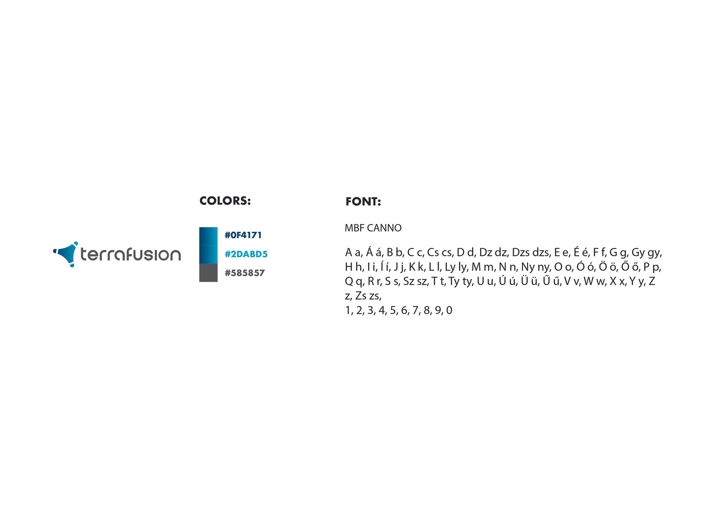
I designed the logo for Terrafusion, a mapping company specializing in advanced geospatial solutions. The logo reflects their innovative approach to mapping and data visualization, providing a modern and impactful identity that aligns with their cutting-edge technology.
Watch the logo book for Terrafusion







CAPA Racing Team
I had the honor of designing the CAPA logo for the character and racing team in the Gran Turismo movie. This logo embodies the thrilling energy and sleek precision of the racing world, creating a powerful and bold identity that represents both the character and the high-speed competition.
2023 FINN Sailing Championship
I had the honor of designing the official logo for the 2023 FINN EUROPEANS Finn Sailing Championship, blending modern aesthetics with the spirit of competitive sailing. The logo reflects the dynamic energy and tradition of the sport, providing a bold visual identity for this prestigious event.

Watch the other logo variations what I made for the Championship

Dropin
I had the pleasure of designing the logo for Dropin, a brand that embodies the spirit of extreme sports and self-expression. The logo captures the dynamic energy and freedom at the heart of the Dropin community, blending creativity and adrenaline to inspire athletes and artists alike.

Watch the other variations of the logo

PlatinumDrop
I had the pleasure of designing the official logo for PlatinumDrop, a Berlin-based production company. The logo embodies a sleek and modern aesthetic, representing the company's dynamic approach to film and media production, while reflecting its commitment to high-quality, impactful storytelling.
InterMap
I had the opportunity to design the official logo for InterMap, a company specializing in cutting-edge mapping solutions. The logo captures the precision and innovation at the core of their services, blending modern design elements with a global perspective to represent their commitment to providing accurate and advanced mapping technologies.
PMI
I had the privilege of designing the logo for the prestigious Prédl-Molnár-Illy Ügyvédi Társulás law firm. The logo embodies professionalism and trust, with a sleek and modern design that reflects the firm's commitment to providing expert legal services while upholding the highest standards of integrity.

ESCA Restaurant
I had the privilege of designing the official logo for ESCA Restaurant, combining an elegant and contemporary aesthetic with a refined, minimalist approach. The design reflects the restaurant's focus on quality and sophistication, with a unique and memorable visual identity that mirrors the culinary artistry and dining experience offered by the establishment. The sleek, hand-drawn form represents both creativity and refinement, ensuring that the logo stands out while embodying the restaurant’s core values.

Tranqulio
I had the opportunity to design the logo for the Tranquilo sailing team, focusing on simplicity and elegance. The clean lines of the sail motif reflect the serenity and balance of the sport, capturing the essence of peaceful navigation and precision.
Procelero Sailing Club
I had the privilege of designing the official logo for Procelero, a sailing club dedicated to fostering a community of passionate sailors. The logo integrates sleek modern elements with a dynamic shape that symbolizes movement and direction, embodying the spirit of sailing and the club’s commitment to excellence. It serves as a bold and timeless visual identity, capturing the essence of both tradition and innovation in the sport.
ILCA Sailing National Championship
I had the pleasure of designing the logo for the 2022 878 Co. ILCA National Championship, an event celebrating the passion and skill of competitive sailing. The design merges clean, modern typography with symbolic imagery, such as the sail and the athlete, to convey the elegance and energy of the sport. The circular motif and national colors pay homage to tradition while creating a strong visual identity for this prestigious event.

Kronenkoenig
I had the opportunity to design the logo for KronenKoenig, a Berlin-based dental technician specializing in precision and excellence. The design combines a sleek, modern font with subtle curves that hint at the artistry and craftsmanship involved in dental work. The crown symbol, paired with a tooth, conveys both the brand's regal quality and its core focus, creating a striking and professional identity that stands out in the dental industry.
SSL Team Hungary
I was honored to create the logo for SSL Team Hungary, a team representing excellence and passion in competitive sailing. The design features a bold and striking character symbolizing strength and leadership, set against a compass motif to reflect navigation and exploration. The use of national colors highlights pride and unity, while the dynamic layout captures the competitive spirit of the team. This logo stands as a powerful visual identity, embodying both tradition and ambition.

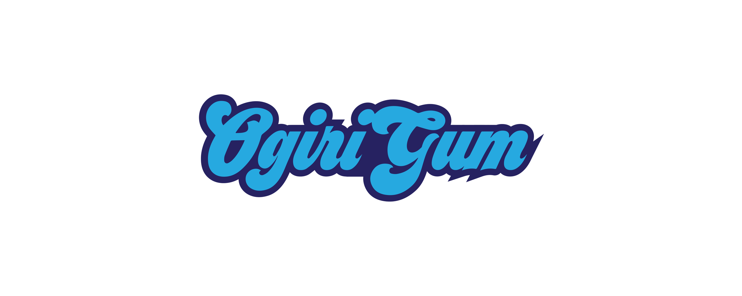
OgiriGum
I had the exciting opportunity to design the logo for OgiriGum, a chewing gum brand. The playful typography and vibrant shades of blue reflect the brand's youthful energy and fun spirit. The rounded, dynamic style captures the joy and liveliness associated with chewing gum, while ensuring a bold and memorable visual identity. This logo encapsulates the essence of freshness and creativity, perfectly aligning with the brand's appeal to a diverse and energetic audience.
Anativ
I had the privilege of designing the logo for my own sports brand, Anativ, a name that stands for energy, movement, and strength. The minimalist and bold design reflects the brand's modern approach to sports and lifestyle, emphasizing clarity and purpose. The sharp, angular elements suggest motion and dynamism, aligning perfectly with the brand's focus on performance and innovation. This logo is a powerful representation of the freedom and determination that Anativ embodies.
